Leveraging social media and first-hand experience to improve understanding of the impacts of flooding
By Pablo Herreros Cantis and Jiray Avedisian
For New York City (NYC), Summer 2021 marked a turning point in the way its residents, policy-makers, and engineers manage and perceive extreme precipitation. To begin with, the City has experienced several episodes of flooding with catastrophic consequences. In September 1st, the remnants of hurricane Ida arrived at NYC’s metro area in the form of a tropical storm causing extreme property and infrastructure damages in addition to the loss of dozens of lives.By the time Ida reached NYC, the City was still catching its breath after experiencing hurricane Henri just 10 days earlier, which had brought record-shattering precipitation (7 inches of rain in two days, with a record-shattering one-hour precipitation of 1.94 inches) only to be surpassed by incoming Ida (between six and nine inches of rain, with peaks of more than three inches in a single hour). Weeks before Henri, the storm Elsa had also brought intense precipitation (more than 4 inches in 24 hours) and caused localized flooding in streets, roads, and subway stations.
In May, 2021, the City released its first-ever Stormwater Resiliency Plan, a document that identifies key goals and initiatives for managing current and future flood risk caused by extreme precipitation. The plan includes several innovative approaches to disaster risk reduction, such as the implementation of different scenarios that account for the variability in the magnitude of the storms that NYC may experience. The scenarios considered were used to develop flood risk maps thanks to a groundbreaking effort to study flooding at a city-wide scale in a joint effort between city agencies like MOCR, DEP, and NYCEM, external consultants, and academic partners such as the Urban Systems Lab, Brooklyn College, the Stevens Institute of technology and Colorado State University. As a result, for the first time, the City is able to present spatially explicit data showing simulated pluvial flood risk. This data has a great value for city officials, researchers, NGOs, and the general public, and is now publicly available in the NYC Stormwater Flood Map Viewer and the Urban Systems Lab’s Stormwater Resiliency Platform, a data visualization portal that combines the flood risk maps with other relevant layers to visualize the distribution of exposure and vulnerability to flooding across NYC.
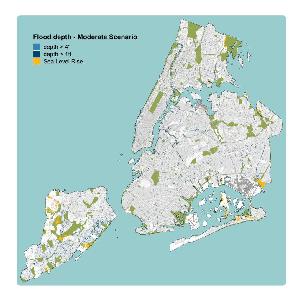
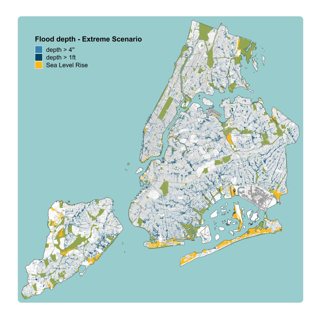
If you haven’t guessed it yet, I am pretty excited about the flood risk maps published, as well as the NYC Stormwater Resiliency Plan. As a researcher working on climate change adaptation, most of my work revolves around combining layers of spatial data to determine how and which vulnerable populations and critical infrastructures may be impacted by a particular extreme weather event, such as flooding. Consequently, I spend a lot of time staring at, producing, sharing, and presenting maps. Having struggled with modeling and mapping flood risk myself, the newly released data came as an exciting opportunity to delve deeper into examining flood risk and its environmental justice implications in New York City. And then Ida hit.
I spent the night Ida reached New York City looking through the window of my street-level apartment. The first thing I could see was the growing river of water flowing by the sidewalk in between the cars. My street did not end up flooding, but that did not stop me from witnessing jarring scenes of flooding that were happening in real time across the City. Hundreds of people were tweeting and posting footage of the flooding taking place almost in real time. As I saw my feed populated with photos and videos showing streets turned into rivers and subway stations turned into underground waterfalls, I could not stop thinking about the recently released flood risk maps. When flood risk is mapped through a model that simulates a simplified version of reality, validating the model’s output is a common challenge. This is because while monitoring infrastructure exists for recording the amount of water flowing in rivers, or tide levels, its use for recording urban flooding events is a rarity at a more experimental stage. It is because of this that several research groups, including some in NYC, have embarked on the journey of collecting crowdsourced data from social media platforms and volunteering citizens to validate their models (as well as to leverage citizen science tools such as MyCoast to support resiliency-planning processes)
In the days that followed the impact of Ida on the City, I, along with other researchers, engineers, planners, and data scientists started exploring the possibility of collecting the vast amounts of footage shared by Twitter users. The first goal of this preliminary research was to compare the locations of tweets showing flooding to the flooding represented in the maps published by the City. To achieve this in a coding environment like R or Python, the tweets showing flooding needed to be translated into geo-referenced point data. While some users share their location data when tweeting, this is not always the case. In fact, in most instances the location where the photo or video was taken is not provided, since they might have received the footage from somebody else or they may have waited to be in a safer or drier location before tweeting. Consequently, generating a map layer with the point locations of the tweets required a high amount of in-depth detective work to determine the exact site in which the flooding had been captured. For instance, if a tweet had the caption “flooding in Williamsburg”, and a video of a junction flooded with more than one foot of water and a seven-eleven in the background, the next step was to search all the seven-elevens located in Williamsburg, Brooklyn, to then visit them virtually via Google StreetView. Through this crafty, but slow process, a team of researchers at the Urban Systems Lab generated a sample of 22 points to be used in future exploratory analyses.
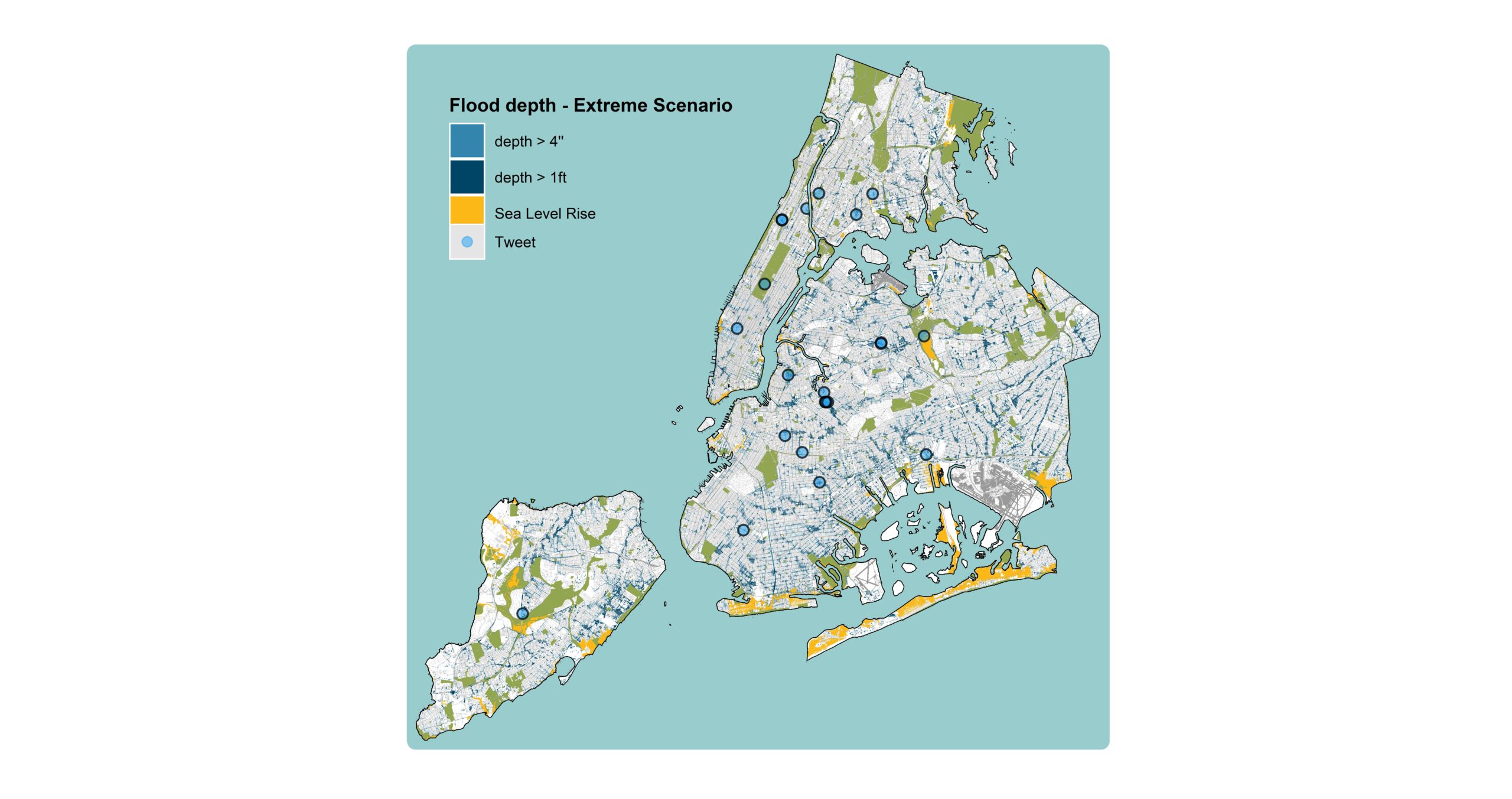
The process of harnessing tweets showing flooding footage, geolocating them, and placing them in comparison to the City’s flood risk map revealed an unexpected side-effect. The detective work to georeference each tweet required long chunks of time, including staring at cars floating over dark, murky waters, people walking and even delivering food through feet-deep flooded streets, and literal geysers of water gushing in subway stations. As I investigated the footage gathered, I realized that I was even having a physical response of aversion. It would not take long to realize that this footage, when exposed for extended periods, is an unsettling example of what the daily conversations of a scientist who works in urban climate change adaptation actually mean in the most explicit way. A researcher’s job may, for months, imply cracking down methodologies, head-banging coding challenges, and long journeys into staring at the cells of tables filled with numbers hard to comprehend. While critically essential in the generation of relevant, evidence based knowledge, this process can alienate the mind from the actual problem that is being tackled – that is, the literal well-being of an entire society. Considering this, the footage examined in the collected tweets came as a harsh reminder of how brutally disruptive the reality of climate change can be – the same climate change I stare at when I read publications by other researchers to learn new methodologies, fix coding bugs, and spend my days making sense of numbers in a spreadsheet – actually is.
Finally, once the videos and photos collected from Twitter had been transformed into single points and placed over a flood risk map, I felt a strange sense of emptiness. Geolocating the tweets had generated a whole new dataset capable of contextualizing the flood risk maps, but that same transformation had also stripped the data from the capacity to stir up my emotions in the same way that the explicit footage had done before. The cars floating in streets flooded with feet of water had become a simplified set of boundaries identifying the extent of different flood categories – a map I had been looking at for a while already. It was then when I realized how flood risk maps do not only fail to communicate the concept of flood risk by turning flooding into a yes-no binary. They also fail to communicate the severity of flooding by turning it into an abstract representation, a color-coded symbology that can only be interpreted as “less to more screwed”. Before Ida, I looked at the darker colored parts of the flood risk map as lower topographic depressions that may accumulate more water. I did understand the fact that flooding there had a higher capacity to cause severe impact to nearby residents, but I had never had a visual image of what that “severe impact” might mean. After Ida, I have virtually witnessed the consequences of flooding in the same streets I have walked and biked on idyllic summer afternoons. The same streets that I might have seen in a map and thought “okay, flooding happens here” without actually confronting the meaning of such a statement.
Based on these observations, it has become clear that flood risk maps are an invaluable tool to understand and communicate flood risk, but that, at times the visceral reality of what they are actually showing might get lost, especially for inexperienced eyes. It is also clear that crowd-sourcing footage showing real-life flooding conveys the devastation and disruption caused by climate disasters in ways that flood risk maps may not. Combining these data sets allows users to alternate between schematic representations of flood risk and their actual meaning based on real, experienced flooding events. As a researcher focused on mapping flood risk, crowd-sourced media has primarily been treated as a pragmatic tool to validate modeling work. However, this experience has taught me that the dialogue between risk maps and the footage showing people and communities experiencing extreme weather events also has the capacity of humanizing maps. This is a much needed effect, considering the power of graphic representations like maps to steer decision making processes based on how they are presented, understood, and believed.
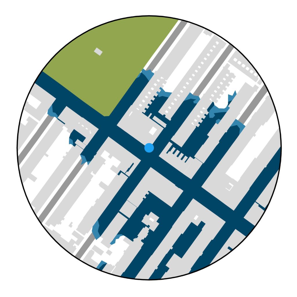
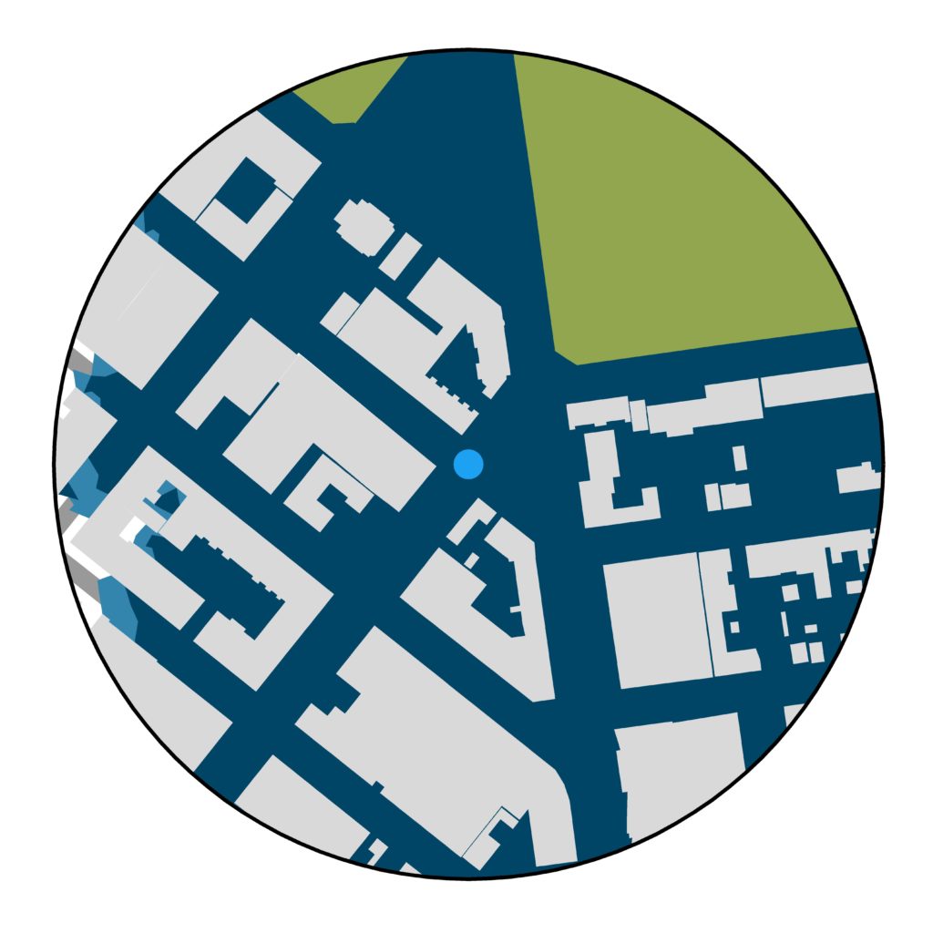
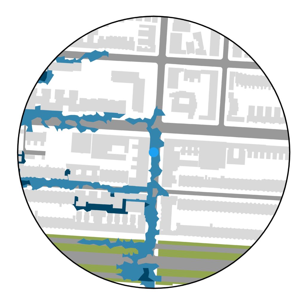
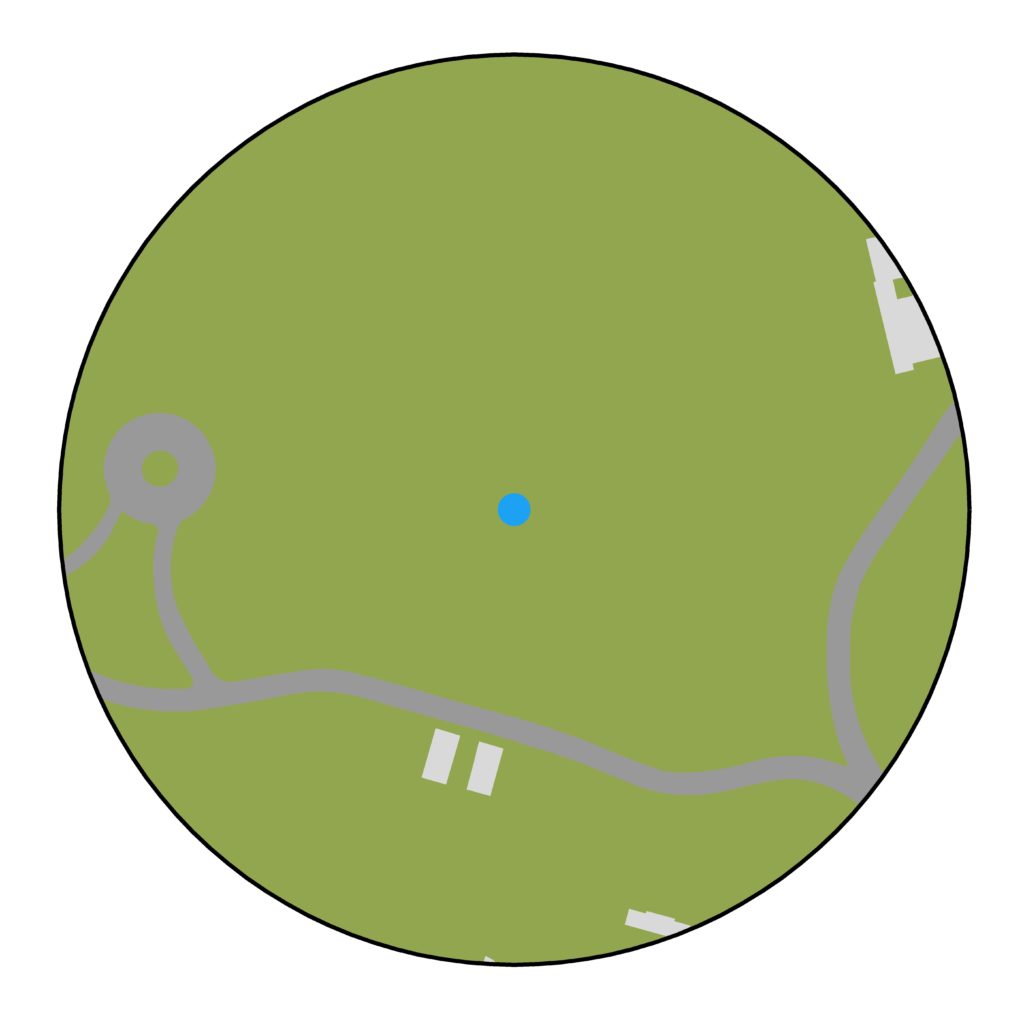
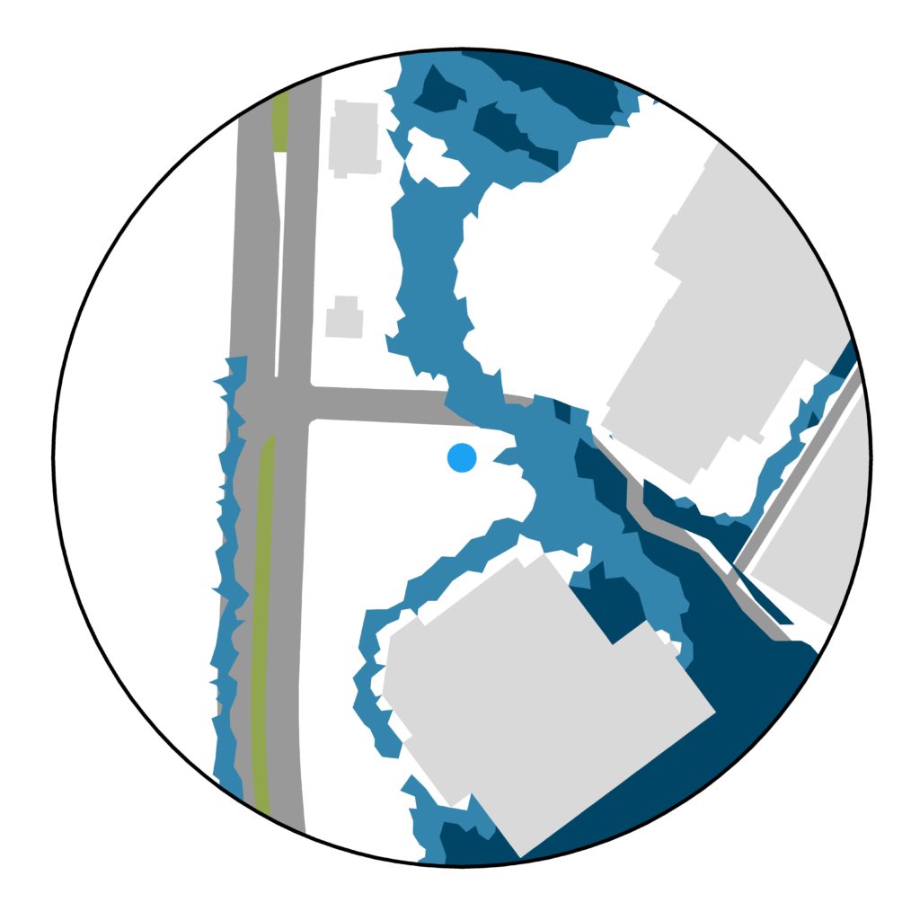
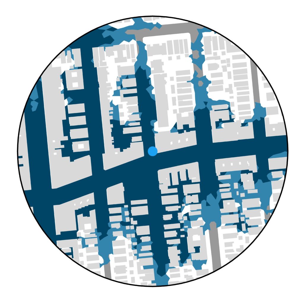
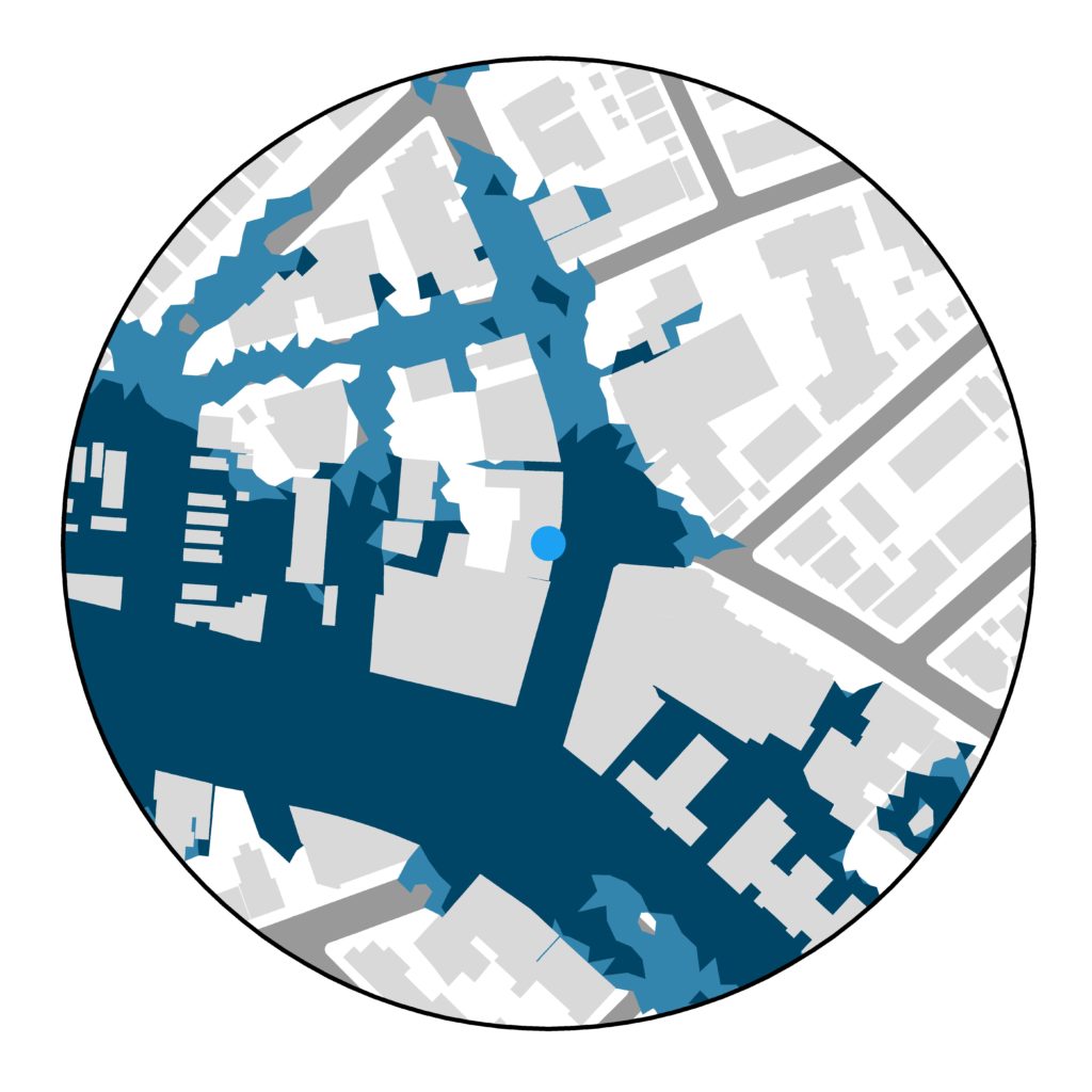
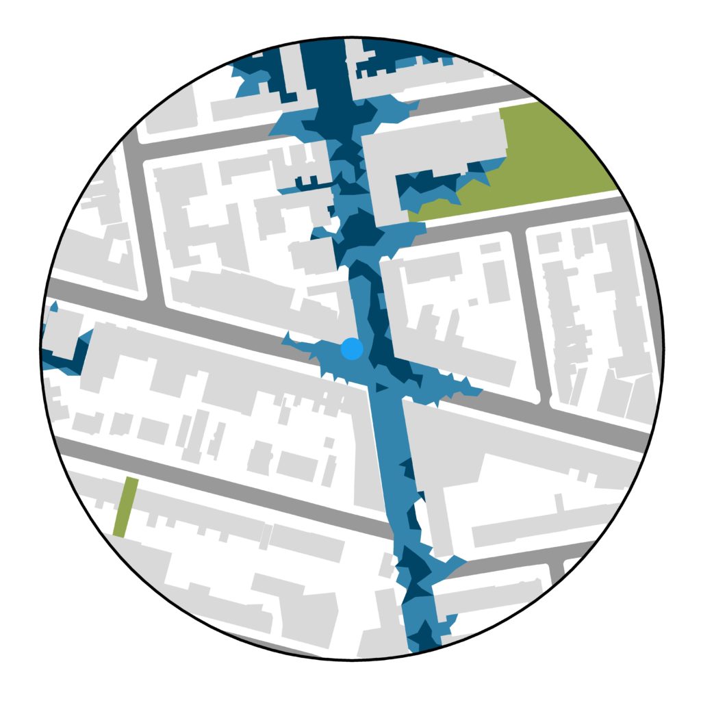
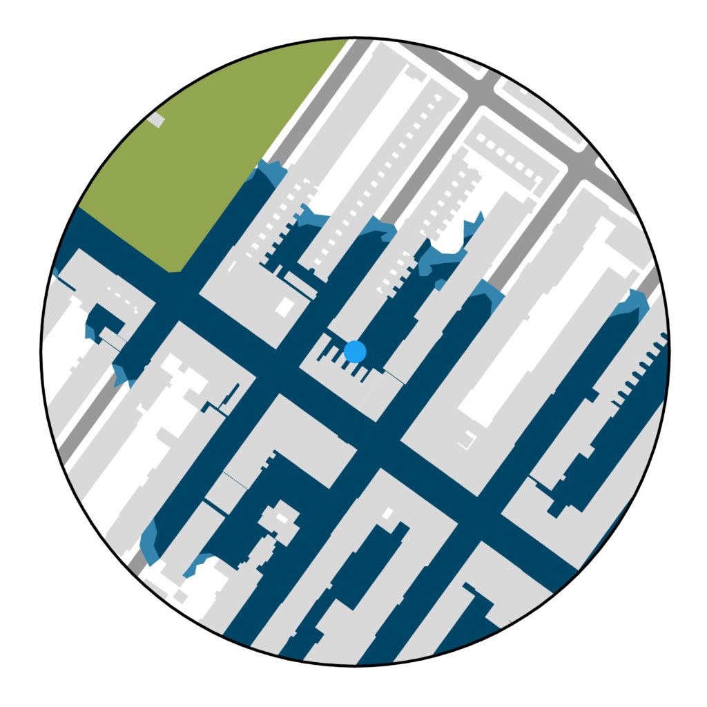
In the images below, the tweets compiled during our work in the Urban Systems Lab are presented side by side with the flood risk maps for the same location under the extreme scenario. I invite readers to observe the differences in both representations of flooding, and to reflect on the kind of emotional or physical response that each of the images trigger. It is important to remember that the water that rained during Ida and the precipitation considered in the flood risk maps are not the same, and the image comparisons shown below should not be taken as a direct means to validate the maps. However, locations that flooded during Ida and that are not shown flooded in the map may be observed to reflect on possible explanations beyond the inaccuracies of the modeling, such as methodological assumptions and limitations.
A note on twitter data and authorship. The tweets shown in this post and the footage shown in them belong to their respective authors. All the tweets shown below have been embedded in this piece after receiving the explicit permission from the person posting the footage. While the original sample of tweets had a size of 22, only 9 people have responded to the permission request, revealing an essential consideration to make when making use of social media data. The author and the editorial staff involved in this piece would like to thank the Twitter users who gave permission to embed their tweets [@KiranDhillonTV, @UnequalScenes, @Flatbush_kloud, @KellyrKopp, @BreakingVideoTV, @Ken4NYC, @JoeEEnglish, @newsistaan, @BushwickLife].
Pablo Herreros studied environmental engineering at the Polytechnic University of Madrid, Spain, where he specialized in environmental impact assessment. Interested in using his knowledge of Geographic Information Systems and ecology for the benefit of society, he moved to Wageningen University in the Netherlands to complete an MSc in urban environmental management. He is now applying socio-ecological analysis to urban ecosystem services and environmental risks, with special focus on their spatial attributes and their links to social justice. He aims to provide policymakers with evidence-based information for spatial planning and design.
Jiray Avedisian is a graduate student in the Design and Urban Ecologies program at Parsons School of Design at The New School. They have extensive experience in leadership development, dialogue-based problem solving, and administrative support. Their academic background is in political anthropology, and they are asking questions about incarceration and the political economy of US cities. Curious, imaginative, and proactive, Jiray is adept at identifying points of difference and communicating across diverse identities, experiences, and organizations.